
In your journey to create a user-friendly website that keeps visitors engaged, it is crucial to know how to design a navigation menu that improves engagement. The navigation menu serves as your website’s roadmap, guiding users to key features and relevant content. If visitors cannot easily find what they need, they are more likely to leave prematurely. By prioritizing clarity, structure, and empathy for your audience’s challenges, you can boost user interaction and support better conversion rates.
When building or redesigning a site, founders and growth marketers often view the menu as a functional afterthought. However, thoughtful navigation design can remove friction for potential clients, encouraging them to stay longer and explore more. This approach is especially important for service businesses aiming to generate leads. A streamlined menu helps visitors focus on core services, contact forms, and trust-enhancing elements that foster confidence in your brand. It can also set the foundation for search engine optimization (SEO).
Understand navigation basics
Navigation includes all the links and menu structures that let visitors move around your site. Clear and organized navigation can increase KPIs by as much as 83% according to DreamHost research (DreamHost). The main job of a navigation menu is to lead users quickly to critical pages, such as your services, contact details, or product listings. A secondary benefit involves reinforcing your site’s SEO by organizing pages to help search engines crawl effectively.
To achieve these objectives, stick with user-centric design principles. Think about your audience’s needs, possible journey, and familiarity with your industry. Keep the menu consistent from page to page, so visitors always know where to look. Even minor inconsistencies in color or placement can disrupt the user experience. Incorporating standard placements, such as a top or upper-right corner placement for your main menu, helps visitors find information without re-learning the site layout.
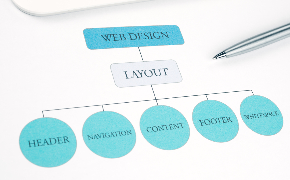
Plan a clear menu structure
A well-structured menu starts with identifying your top priorities. Keep the main menu limited to around five to seven items. Flux Academy advises that more than seven links introduce confusion for many users (Flux Academy). For example, if you run a local HVAC service, consider focusing on categories like “Services,” “About,” “Reviews,” and “Contact.” This focused configuration keeps visitors from feeling overwhelmed.
Beneath each main category, you can structure subcategories if your site covers a wide range of topics. This approach, often achieved with dropdown menus or mega menus, helps you organize content logically. However, be cautious with dropdowns; if implemented poorly, they can become messy. For smaller sites, a concise top menu might be enough. For larger websites, well-designed mega menus can showcase subcategories without sacrificing clarity. Use descriptive labels to guide visitors efficiently.
When planning a clear menu structure, consider your site architecture as a whole. Think about how each page relates to others and how visitors would logically move across them. A helpful internal resource, such as importance of site architecture in website design, can guide you in creating unified page groupings. Organizing categories by user intent can also improve conversions. If it takes fewer clicks to reach important pages, potential clients are more likely to stay engaged.
Optimize for mobile users
A mobile-responsive navigation menu is critical since a large portion of online traffic comes from smartphones. Studies show that nearly 100% of consumers have made purchases on mobile devices (DreamHost). The “hamburger menu,” typically displayed as three stacked lines, is a popular space-saving approach for compact screens. Make sure your menu is easy to tap—icons and text links should be large enough to avoid accidental clicks. This improves usability for all visitors, including those on tablets or older mobile devices.
You also want to test your menu layout on multiple devices and orientations, from smartphones to tablets. More than 60% of traffic originates from mobile channels (MailChimp), so if your users cannot navigate easily, engagements and conversions may drop drastically. This is particularly important if your business relies on form submissions or booking requests for new leads. A well-designed mobile menu removes barriers that might otherwise discourage prospective clients from taking the next step.
ADA compliance considerations
In addition to design principles, ensure your navigation meets ADA (Americans with Disabilities Act) compliance standards. A menu that is screen-reader friendly, offers sufficient color contrast, and provides clear text alternatives for icons can significantly benefit users with disabilities. For more information, see our ada compliance checklist for websites. A fully accessible menu fosters inclusivity and extends your outreach to a broader audience, reflecting a supportive, empathetic approach to design.
Enhance trust and credibility
Trust signals play a critical role in encouraging visitors to explore your site and consider your services. Your navigation menu can highlight these signals by linking to “About Us,” “Client Testimonials,” and “Case Studies” pages. When you make these links readily available, you show transparency. Additionally, placing security badges or membership seals near your main menu can help reassure new visitors that your website, and your business, takes their privacy and safety seriously.
When potential customers land on your site, they often look for quick validation. If you have a “Contact” or “Consultation” page, ensure it is prominent. For instance, you might position it as the last menu item to take advantage of the serial position effect, which suggests users remember the first and last items best (Flux Academy). If your site includes a “Team” page showcasing professional credentials, link it near the top to establish authority without delay.
You can also integrate trust-building content directly into submenus. For example, under “Services,” you might include links to specialized pages that detail the training, certifications, or credentials of your staff. Highlighting research-based methods can further communicate expertise. By making these links easy to find in the menu, you reduce the chances of prospective clients leaving in frustration. If you specialize in local services, adding a “Local Expertise” submenu can emphasize your community knowledge.
Improve performance metrics
Speed and usability intersect when it comes to your navigation menu. Slow-loading menus can frustrate users and cause them to leave. Compressing images, optimizing code, and reducing the number of scripts can make your menu load faster. If you are using WordPress, consider solutions covered in wordpress plugins for website performance and security. Quick load times enhance the user experience and help you maintain strong engagement rates, fulfilling a primary goal of your design strategy.
Core Web Vitals, a set of performance signals that Google uses to rank pages, place emphasis on aspects like loading speed and visual stability. A bulky or poorly coded navigation menu might shift or flicker when loading, disrupting the user experience. By testing your site’s performance and streamlining the menu, you can improve your Core Web Vitals, boost your SEO, and ensure visitors remain focused on your content rather than technical glitches.
Using analytics for insights
To measure whether your navigation menu truly improves engagement, utilize analytics tools like Google Analytics or heatmap software. These tools help you assess where users click, where they spend the most time, and if they abandon certain navigation paths. If you find that a frequently visited link is buried in a submenu, you can move it to the main menu. This data-driven approach aligns with continuous improvement and ensures you address evolving visitor needs.
Create a lead-friendly structure
Effective navigation can go beyond helping visitors find information. It can also guide them toward completing forms and other conversion-related actions. Place your “Contact” or “Request a Quote” link in a prominent menu position to capitalize on user momentum. If your business model relies on scheduled appointments, consider featuring a “Book Now” button. For more details on incorporating scheduling, explore how to integrate forms and booking into your website. This direct link in the main menu helps prospective customers transition from curiosity to action.
Be mindful of how forms are integrated. Loading too many forms on a single page can overwhelm your visitors, which is why many service companies showcase just one or two simple contact fields. For more tips on conversion-focused placement, you can explore how to create a contact page that converts. The easier you make it for potential clients to reach you, the more likely they are to engage.
Building trust through design choices
Your navigation’s design—from color choices to spacing—can reinforce confidence. White space around your main menu items can highlight them effectively, making your site look clean and modern. More on this can be found in why white space matters in web design. By demonstrating empathy for your audience’s preference for uncluttered visuals, you create an experience that feels supportive, guiding them gently toward relevant information and calls to action.
Integrate site architecture and hierarchy
Navigation is part of a larger “site architecture,” influencing how pages interconnect and how easily users navigate them. A carefully planned hierarchy ensures that no important pages are buried. Group pages logically; for instance, group all your professional services under one category. If you need help with the bigger picture, read how to plan a website content structure. The goal is to maintain a seamless path through your site from entry point to conversion.
Consider the synergy between navigation menus, page layouts, and calls to action. Placing a link to your “Services” page in the main menu is step one, but linking it to a carefully designed landing page is equally important. You might find relevant insights in what to include on a high converting landing page. Every element, from headings to form placement, should tie together cohesively, reinforcing your site’s purpose and uplifting user confidence.
Test and iterate effectively
Designing a navigation menu that improves engagement is an iterative process. Conduct user testing to see how people are interacting with your current layout. Keep an eye on bounce rates, time on page, and conversion funnels. Tools like A/B testing allow you to compare menu variations to identify which yields better results (Analytico Digital). Approach feedback with an empathetic mindset—your visitors’ struggles and successes inform the next round of improvements.
Once you implement changes, follow up with an analytics review. Are users clicking on crucial links more frequently? Has your scroll depth increased on key pages? If not, adjust your layout, labels, or menu position. Overhauling your navigation overnight may not be wise. Instead, focus on incremental improvements so you can pinpoint what works. This supportive approach ensures you do not disrupt your users’ experience or confuse returning visitors.
Ongoing performance checks
Regular check-ups on site speed, mobile responsiveness, and accessibility help maintain an optimal experience. If you offer location-based services, confirm that your menu’s structure supports local SEO. You might also look into how to structure a website for local seo for more insights. Recording changes and results helps you identify trends over time, ensuring your navigation menu continues to address user needs.
Consider WordPress solutions
For many service businesses, WordPress is a popular choice for website building. Themes designed with conversion in mind can simplify your menu development process. However, do your research to ensure the theme you choose offers robust menu customization. Our guide on choosing the best wordpress theme for your business covers essential features. Alternatively, custom-coded solutions can be tailored precisely to your local market, allowing you to emphasize your unique services more effectively.
WordPress offers plugins that can help optimize menus for speed, mobile responsiveness, and SEO. Look for reputable, regularly updated options, and test them carefully to ensure compatibility with your theme. However, be wary of installing too many plugins, as that can slow your site’s performance. Prioritize the features essential for an effective navigation system. By balancing functionality with efficiency, you deliver an experience that respects your audience’s time and helps them find what they need quickly.
Align with lead-focused content
Your navigation menu is not an isolated feature. It should align with the broader content strategy, guiding visitors to resources that demonstrate your expertise and encourage them to connect with you. If you focus on local service offerings, highlight geospecific pages or case studies. This alignment extends to your calls to action, which should appear consistently throughout the site. If your navigation is well-structured, these calls to action become a natural extension of the visitor’s browsing path.
Review your pages to ensure the content behind each menu link is lead-focused and relevant. For instance, a “Service” page should specify the value, process, and evidence-based outcomes you deliver to clients, whether you are a plumber or a marketing consultant. This clarity underscores the empathy you have for your audience’s challenges—readers should feel you understand their issues and offer solutions. If you need help refining service pages, see how to write content for a service page.
Another important step is emphasizing trust-building signals within the pages linked by your menu items. Display verified testimonials, highlight success stories, and provide contact details. By offering an action-driven reading experience, you lower barriers for potential clients to reach out. The synergy of a thoughtful navigation design and relevant, empathetic content can solidify your website as a valuable resource and encourage visitors to move from exploring to inquiring.
Conclude with next steps
Your navigation menu often shapes the first impression visitors have of your website. By prioritizing clarity, mobile responsiveness, and empathy for user needs, you build trust and drive higher engagement rates. This leads to an increase in leads, conversions, and overall brand credibility. If you are looking for further guidance on creating a conversion-focused site, explore how to improve website user experience or how to optimize website speed for better performance.
Remember, a successful menu is never truly finished. Ongoing analysis, user testing, and updates ensure it remains a support for your audience. Whether you are a local service business or a rapidly scaling enterprise, building a navigation menu that seamlessly guides visitors toward the right solutions is key to sustainable growth. With a consistent, data-driven approach, you can anticipate your audience’s expectations and give them a simple but powerful path through your website.
By following these steps and iterating thoughtfully, you will steadily refine how you design a navigation menu that improves engagement. Each adjustment can bring you closer to a site experience that communicates trust, boosts conversions, and supports your overarching business goals. Continue refining your menu to reflect visitor feedback and evolving industry standards for an adaptable, future-proof website that consistently delivers a positive, user-focused experience.